- Published on
TailwindCSS Dark Mode Using Class Mode
- Authors

- Name
- Saleem Hadad
- @saleemhadad
Adding the flexibility of changing a website's theme to dark mode is now a trend in web development. TailwindCSS V2 made that feature is extremely simple to do so. In this article, I'll show you how to enable the dark mode functionality using a simple switch button and store that in the localStorage.
In this article, we'll rebuild Upwork's landing page's first two sections using TailwindCSS with one additional button that enables users to switch between dark and light themes. Cool? let's get started.
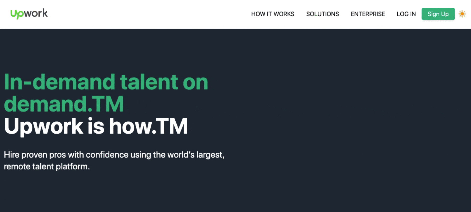
Final output:
The steps we'll follow:
- Create a new project.
- Install the needed dependencies.
- Configure PostCSS, and TailwindCSS.
- Add NPM script to "compile" the TailwindCSS directives.
- Create HTML template.
- Write a JavaScript script to allow users to change the theme.
- Summary, code, and video tutorial.
Note: I'll assume you have basic knowledge of TailwindCSS before you read this article to get the most out of it. If you're new to TailwindCSS I advise you to take a look at this video series by the creators of TailwindCSS to understand its concept first.
Step #1: Create a new project
To create a new project, run the following command:
mkdir upwork && cd upwork
First, we need to generate package.json to keep track of your project's dependencies. To generate the file quickly run the following command:
npm init -y
Beginner note: The
-yflag will fill in the questions automatically that you'll be asked by runningnpm initalone.
Step #2: Install the needed dependencies
Beginner note: Please insure that you have installed NodeJs on your machine.
Now, let's structure our project quickly first before we install the needed dependencies.
Run the following commands inside your project root:
mkdir public          # here our index.html and final app.css will live.
mkdir src/css         # needed to store our source CSS file
touch src/css/app.css # we'll use this file to include TailwindCSS directives
After running the above commands, your project's list should look like this:
.
├── package-lock.json
├── package.json
├── public
└── src
    └── css
        └── app.css
Finally, to install TailwindCSS we need the following dependencies:
- tailwindcss
- postcss => To compile TailwindCSS and generate the final CSS file.
- autoprefixer => we used to enable prefixing utilities for all browsers, see here.
To install all of them, run the following command:
npm i tailwindcss postcss autoprefixer
Note: We also need to install postcss-cli to run postcss commands using the terminal. However, we need this dependency only in the dev env.
npm i -D postcss-cli
Step #3: Configure TailwindCSS, and PostCSS
In this step, we'll configure each of TailwindCSS and PostCSS in order to compile the final CSS file that includes all Tailwind utilities.
- TailwindCSS
Run the following command first to generate the minimal Tailwind configurations file:
npx tailwindcss init
Then open the generated file tailwind.config.js and enable the dark mode by setting it to class mode.
module.exports = {
  purge: [],
  darkMode: 'class', // <= 'media' or 'class'
  theme: {
    extend: {},
  },
  variants: {
    extend: {},
  },
  plugins: [],
}
Cool note: There are two modes we can enable the dark mode,
media, andclass. The difference between them is thatmediamode will rely on the operating system directly of our users, wherein theclassmode we have more control on when to switch to dark/light regardless of the OS of our clients.
The last step is to add TailwindCSS directives into src/css/app.css:
@tailwind base;
@tailwind components;
@tailwind utilities;
- PostCSS
We use PostCSS to compile TailwindCSS internal utilities into our final CSS file to be used in our project.
To generate the config file, run this command:
touch postcss.config.js
Finally, add the following config to enable both TailwinCSS and Autoprefixer as plugins.
module.exports = {
    plugins: {
      tailwindcss: {},
      autoprefixer: {},
    }
}
Step #4: Add NPM script to "compile" the TailwindCSS directives
This step is completely optional but I like to do it so that I don't need to remember the command needed every time I need to compile TailwindCSS.
The command we use to compile TailwindCSS is:
postcss src/css/app.css -o public/app.css
Beginner note: The command above will compile the file
src/css/app.cssand generate the output to any file we need via-oflag, in this case, we usedpublic/app.css.
Finally, let's add the above command to our scripts inside package.json so that we can run an alias short command.
{
  ..
  "scripts": {
    "dev": "postcss src/css/app.css -o public/app.css"
  },
  ...
}
Now, every time you need to compile TailwindCSS, just run:
npm run dev
Step #5: Create HTML template.
- Creating navbar:
Note: notice here we added one button with
id="switchTheme"to be used later in JavaScript to toggle between the dark and light modes.
<nav class="border-b dark:border-gray-500 bg-white dark:bg-gray-900">
    <div class="max-w-7xl mx-auto flex items-center h-20 w-full justify-between px-4">
        <svg xmlns="http://www.w3.org/2000/svg" viewBox="0 0 102.4 30" width="106" height="30" role="img" aria-hidden="true"><path fill="#494949" d="M65.4 6.9c-4.5 0-8.1 3.6-8.1 8.1s3.6 8.1 8.1 8.1 8.1-3.6 8.1-8.1-3.6-8.1-8.1-8.1zm0 12.9c-2.6 0-4.8-2.1-4.8-4.8s2.1-4.8 4.8-4.8c2.6 0 4.8 2.1 4.8 4.7 0 2.7-2.1 4.9-4.8 4.9zM83.4 10.8c-2.3 0-4.2 1.9-4.2 4.2v7.7h-3.5V7.4h3.5v2.4c1-1.5 2.7-2.4 4.5-2.4h1.1v3.4h-1.4zM48.2 7.4L50.8 18l2.9-10.6h3.4l-4.4 15.3h-3.5L46.5 12l-2.7 10.7h-3.5L35.9 7.4h3.4L42.2 18l2.7-10.6zM95 14.4c2.6-1.4 4.1-4.1 4.1-7.1h-3.4c0 2.6-2.1 4.6-4.6 4.6h-.5V0h-3.5v22.7h3.5v-7.2h.4c.4 0 .8.2 1 .5l4.9 6.7h4.2L95 14.4z" class="logo-work"></path> <path fill="#6fda44" d="M27.6 6.9c-3.8 0-6.7 2.5-7.9 6.5-1.8-2.7-3.1-5.7-4-8.8h-4.1v10.6c0 2.1-1.7 3.8-3.8 3.8S4 17.3 4 15.2V4.7H0v10.6c0 4.3 3.5 7.9 7.9 7.9s7.9-3.5 7.9-7.9v-1.8c.8 1.7 1.8 3.3 2.9 4.8L16.2 30h4.2l1.8-8.5c1.6 1.1 3.5 1.7 5.5 1.7 4.5 0 8.1-3.6 8.1-8.1-.1-4.5-3.7-8.2-8.2-8.2zm0 12.2c-1.7-.1-3.3-.7-4.6-1.8l.3-1.6v-.1c.3-1.7 1.3-4.6 4.2-4.6 2.2-.1 4 1.7 4.1 3.9.1 2.2-1.7 4-3.9 4.1l-.1.1z"></path></svg>

        <div class="flex items-center">
            <button class="hidden lg:block px-4 dark:text-white">HOW IT WORKS</button>
            <button class="hidden lg:block px-4 dark:text-white">SOLUTIONS</button>
            <button class="hidden lg:block px-4 dark:text-white">ENTERPRISE</button>
            <button class="px-4 dark:text-white">LOG IN</button>
            <button class="bg-green-500 text-white rounded shadow-md px-4 py-1">Sign Up</button>
            <button id="switchTheme" class="h-10 w-10 flex justify-center items-center focus:outline-none text-yellow-500">
                <svg class="w-6 h-6" fill="currentColor" viewBox="0 0 20 20" xmlns="http://www.w3.org/2000/svg"><path fill-rule="evenodd" d="M10 2a1 1 0 011 1v1a1 1 0 11-2 0V3a1 1 0 011-1zm4 8a4 4 0 11-8 0 4 4 0 018 0zm-.464 4.95l.707.707a1 1 0 001.414-1.414l-.707-.707a1 1 0 00-1.414 1.414zm2.12-10.607a1 1 0 010 1.414l-.706.707a1 1 0 11-1.414-1.414l.707-.707a1 1 0 011.414 0zM17 11a1 1 0 100-2h-1a1 1 0 100 2h1zm-7 4a1 1 0 011 1v1a1 1 0 11-2 0v-1a1 1 0 011-1zM5.05 6.464A1 1 0 106.465 5.05l-.708-.707a1 1 0 00-1.414 1.414l.707.707zm1.414 8.486l-.707.707a1 1 0 01-1.414-1.414l.707-.707a1 1 0 011.414 1.414zM4 11a1 1 0 100-2H3a1 1 0 000 2h1z" clip-rule="evenodd"></path></svg>
            </button>
        </div>
    </div>
</nav>
Note: as you can see, we use
dark:directive to some classes so that when the dark mode is enabled, the class appended todark:will override the default (light) one.
- Hero section:
<main class="bg-gray-800 dark:bg-gray-900">
    <div class="max-w-7xl mx-auto py-24 grid grid-cols-2">
        <div>
            <h1 class="py-4 text-green-500 dark:text-yellow-500 font-bold text-6xl">
                In-demand talent on demand.TM <br/> <span class="text-white">Upwork is how.TM</span>
            </h1>
            <p class="text-2xl text-white py-4">
                Hire proven pros with confidence using the world’s largest, remote talent platform.
            </p>
        </div>
    </div>
</main>
Step #6: Write JavaScript script to allow users changing theme.
In order to toggle between themes, we need first to listen to the button if clicked, we can do that using onclick method or by using the id of the button.
Note: in the code provided, I used localStorage to keep track of the selected mode because it's very simple. However, if you need something more advance as a different storage service such as DB or cookies, feel free to do so.
<script>
    document.getElementById('switchTheme').addEventListener('click', function() {
        let htmlClasses = document.querySelector('html').classList;
        if(localStorage.theme == 'dark') {
            htmlClasses.remove('dark');
            localStorage.removeItem('theme')
        } else {
            htmlClasses.add('dark');
            localStorage.theme = 'dark';
        }
    });
</script>
So far, so good, right? Yes!
However, we have one small problem, if you try to refresh the page while dark mode selected the page will go back to the light (default) theme. The reason for that is because we're not tracking the saved value of localStorage.theme once the page is loaded.
To fix this problem add the following code to your HTML's head:
<script>
    if (localStorage.theme === 'dark' || (!'theme' in localStorage && window.matchMedia('(prefers-color-scheme: dark)').matches)) {
        document.querySelector('html').classList.add('dark')
    } else if (localStorage.theme === 'dark') {
        document.querySelector('html').classList.add('dark')
    }
</script>
Step #7: Summary, code, and video tutorial.
As you saw, it's very straightforward to enable the dark mode feature with just a few lines of code and the help of localStorage to keep the value stored on the client-side.
To review what we did so far in a video format, watch this video on YouTube: https://www.youtube.com/watch?v=4OM26EUodFE
You can find the source code here on my Github account.